
In the first quarter of 2026, KOBU Agency launched four carefully crafted websites for four very different organisations: For Cruz Vermelha Portuguesa, CarmoWood, Cabopol and Domitur.
Different sectors. Different audiences. Different levels of complexity. But one shared belief: a website should never be just a website. When a brand opens a physical location, the space design is carefully considered to ensure customers have a welcoming experience. Product placement is key. The navigation inside the space is studied to ensure customers find the products they’re looking for. Fragrances maybe considered to enhance the experience. This is exactly the kind of attention to detail we should put when designing a website, to make sure we create a real brand experience. It should be a living expression of strategy. A place where positioning becomes structure, narrative becomes navigation, and design becomes a tool for trust and action.
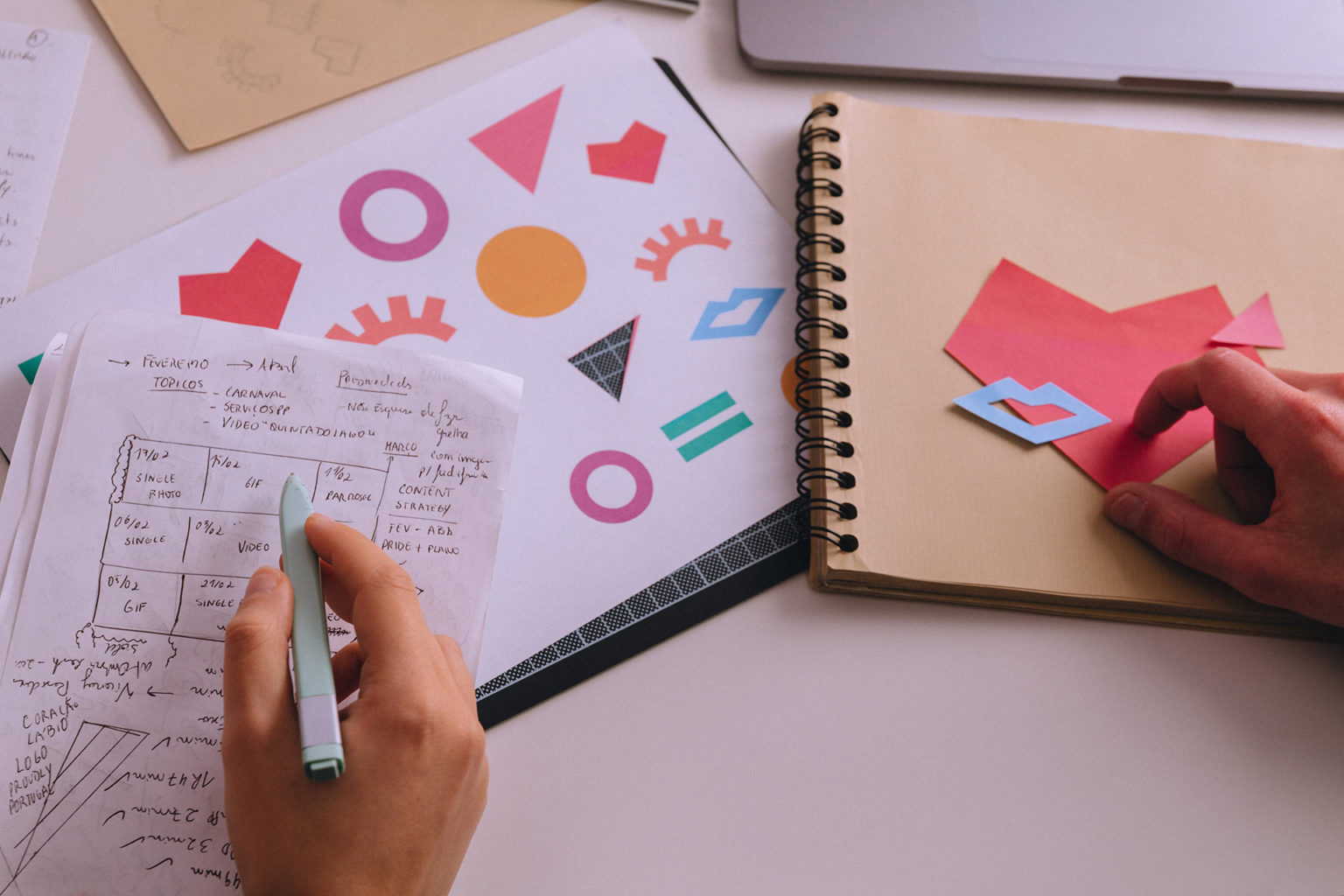
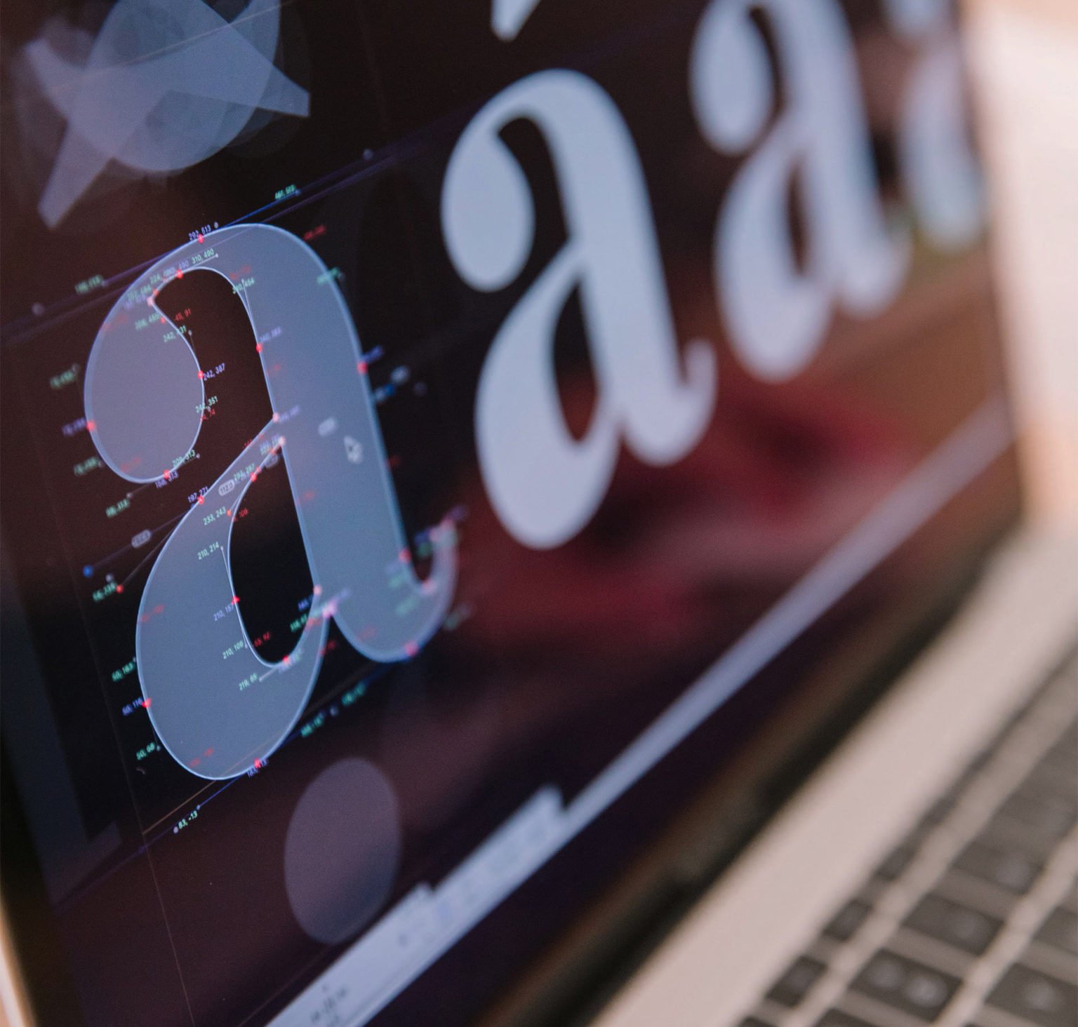
At KOBU Agency, we like beautiful things. But we also like useful things. Preferably, things that do both while quietly solving hard strategic problems in the background.
These four launches gave us exactly that kind of challenge.
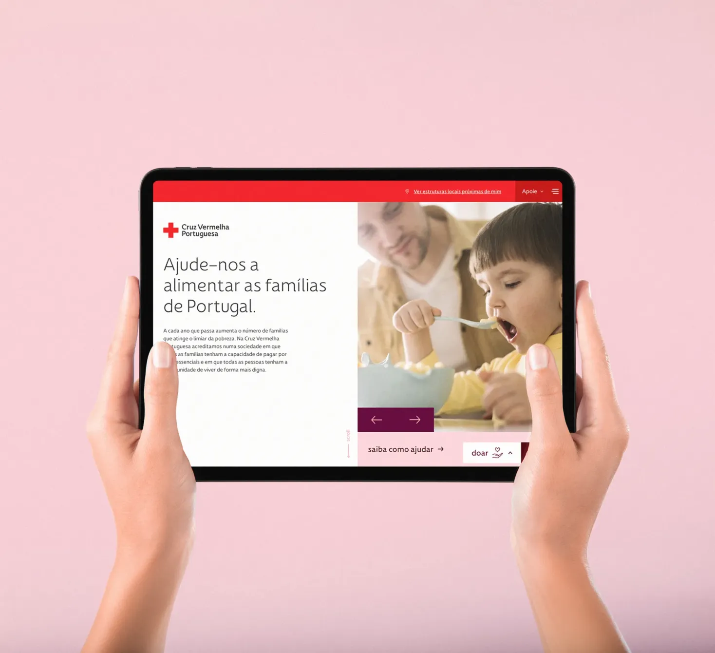
Cruz Vermelha Portuguesa: designing for dignity
Some websites sell products. Some explain services. Some need to mobilise people around urgent human needs.
The Cruz Vermelha Portuguesa project belongs to the third category.
As a humanitarian organisation, Cruz Vermelha Portuguesa works to prevent and alleviate human suffering in Portugal and around the world, providing humanitarian and social assistance, especially to the most vulnerable, while defending life, health and human dignity. It is an institution with 160 years of history, with a legacy website that had more than 60.000 indexed URLs.
The new website needs to support donations, volunteering, corporate engagement, institutional information, transparency, services, news and local structures, while preserving the emotional and ethical weight of the organisation’s mission. The platform also reflects the scale of the institution, including more than 150 local structures and the involvement of more than 5,000 volunteers.
For Cruz Vermelha Portuguesa, the experience had to balance urgency with dignity. Dignity.
The homepage places donation at the centre, but frames it through autonomy, respect and the possibility of helping people rebuild their lives with strength and voice. That distinction matters. Because the way we design a call to action shapes the way people understand the action itself.
The project was built around the core user of the brand. Everyone, at some point in their lives, requires assistance and, in those moments of need, Cruz Vermelha Portuguesa is that, at the tip of a finger, to provide assistance.
Check the website at https//www.cruzvermelha.pt.
CarmoWood: digital revamp for a company built on resilience
CarmoWood went through a major rebrand in 2025. With 45 years of experience, more than 350 employees, three manufacturing plants in Portugal and an international reach, the company stands as a national and European reference in treated wood solutions for agriculture, protection, construction, engineering, tourism, leisure and telecommunications.
The brand is also branching into two clear areas: CarmoFarm and CarmoForm. One rooted in agricultural solutions. The other in wood engineering and construction. The website had to make that structure visible, intuitive and expandable without losing the company’s original essence.
The result is a digital experience that treats wood not only as a material, but as a strategic metaphor for resilience, growth and transformation.
CarmoWood’s new website organizes a broad and technical portfolio into a clearer ecosystem, helping users move from sector to solution, from product to project, and from expertise to trust. The experience makes room for scale, but also for storytelling. Because even in B2B, meaning matters.
“Wood we are” says CarmoWood. Digital we made it behave.
Check the website at https://www.carmowood.com.
Cabopol: making industrial complexity easier to navigate
Cabopol came with a different kind of challenge: how do you make advanced polymer engineering feel clear, credible and future-facing?
The company specialises in the research, development and production of high-performance polymers, including thermoplastic and crosslinked compounds. With more than 60 years of expertise, five production facilities, 25 production lines and a total annual production capacity of 130,000 tons, Cabopol operates in a highly technical, highly demanding industrial landscape.
Its new website needed to speak to engineers, buyers, partners and international industry stakeholders without flattening the depth of the company’s expertise. The digital experience positions Cabopol around a strong strategic idea: Reengineering the Future of Polymers.
From there, the website creates a more navigable relationship between applications, material families, product brands and sustainable solutions.
Wire and cable. Injection and extrusion moulding. Footwear. Automotive. Packaging. Recycled and biobased alternatives. Each area needed its own logic, but the whole system needed to feel unified. This is where a digital experience becomes architecture. Not decoration. Not “a new look.” Architecture.
A way to help people understand what the company does, why it matters, and where its solutions can go next.
Check the website at https://www.cabopol.com.
Domitur: designing an encounter with Portugal
Domitur works in a more emotional territory, but no less strategic.
A leading Destination Management Company based in Portugal since 1988, Domitur creates tailored travel experiences for tour operators, M.I.C.E. agencies and sports organisations. Its work combines deep local knowledge with rigorous execution, covering everything from luxury travel and golf to nature tours, wine tours, sports events, transfers, accommodation and curated experiences.
For Domitur, the digital challenge was not just to show Portugal. It was to make Portugal feel carefully opened and Domitur as a leading partner with extensive knowledge of the region.
The new website builds a more immersive and curated entry point into the country, presenting destinations and journeys through a structure that feels both elegant and operational. It brings together data that was dispersed across different websites for their business segments, into a unified platform that strengthens the brand, it’s legacy and offer.
It invites users to discover, experience and indulge in Portugal, while giving business partners the clarity they need to understand Domitur’s expertise and service range.
Good destination branding is never only about the place. It is about anticipation.
Before the trip begins, the experience begins.
Domitur’s digital presence now reflects that: a sense of encounter, precision and emotional depth. Portugal, but designed with intention.
Check the website at https://www.domitur.pt.
Four launches. One method.
Cruz Vermelha Portuguesa, CarmoWood, Cabopol and Domitur are not connected by sector. They are connected by the kind of strategic work they demanded.
Each project required us to understand a different business reality, translate complexity into a clear vision, and create a digital system capable of growing beyond launch day.
For Cruz Vermelha Portuguesa, it meant designing an institutional experience around human dignity. For CarmoWood, that meant organising a broad agricultural and wood construction ecosystem without losing the brand’s rooted identity. For Cabopol, it meant making advanced materials and technical applications easier to understand, explore and activate. For Domitur, it meant turning Portugal into a curated digital journey for international tourism partners.
Because a digital experience is not finished when it goes live. That is just the moment it begins to work.
It begins to guide decisions and inform audiences. To convert interest into action. To make invisible strategy visible.
And yes, sometimes it also needs to look stunning while doing all that.
We can live with that.