


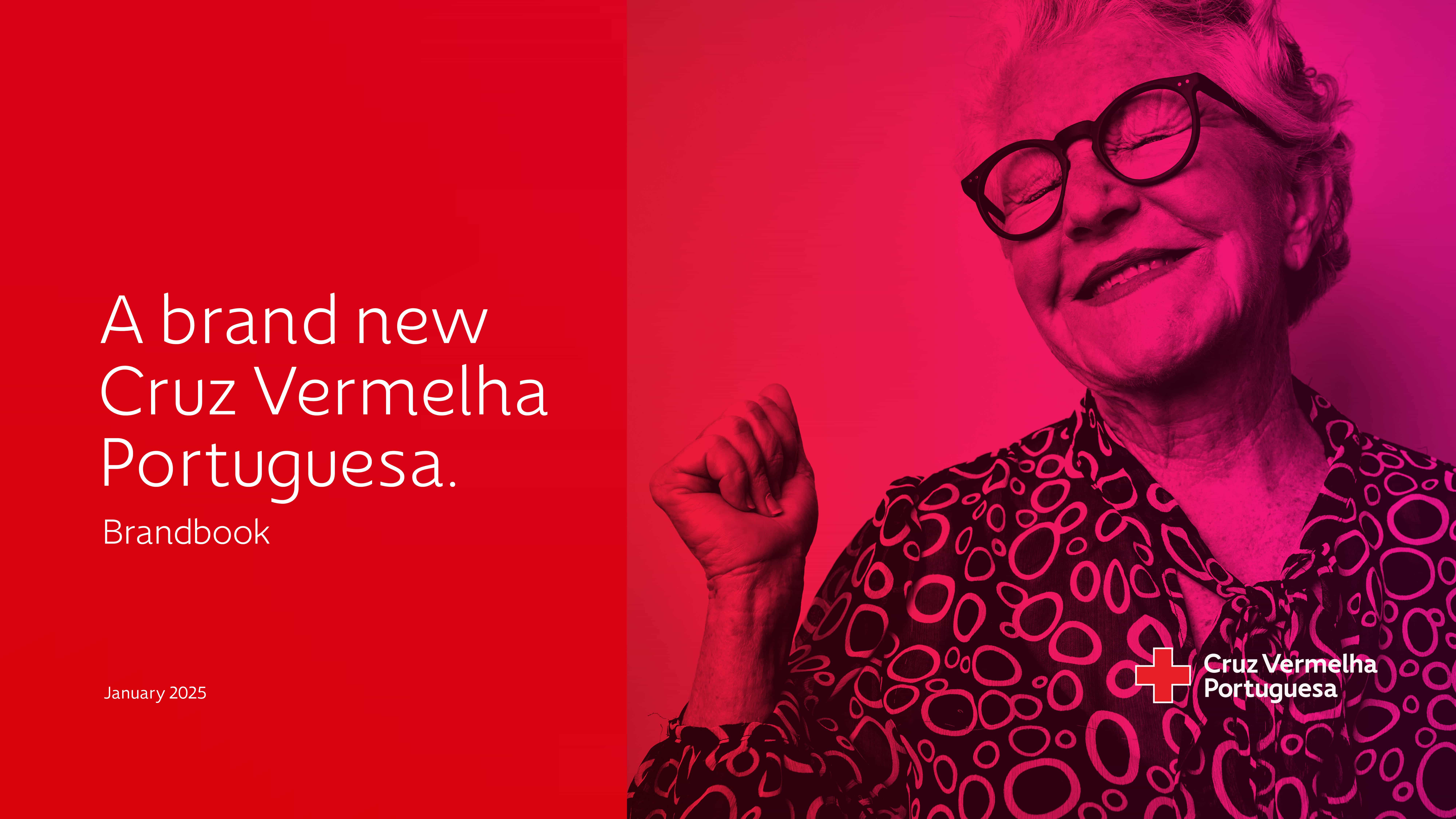
The Red Cross brand is iconic. It’s a brand with a worldwide reach and a historical meaning that few brands have. However, despite the institution’s grandeur, its brand is not immune to the challenges of the passage of time. The Portuguese Red Cross approached us due to increasing operational fragilities in communication. There was a sense of misalignment between the public brand perception and the true social impact of the institution. Our diagnosis was prompt: lack of a structured design for social impact.
Different causes may explain this gap, but it was primarily due to a lack of adaptation to evolving times. The brand lacked design for social impact and failed to follow up with the evolution of society and the demands of today’s multichannel communication. This gradual distancing of the public from the brand, even a disconnection, fed the misalignment feeling over recent times. Could this broken relationship be restored?
We were fully aware from the outset that we had a larger-than-life brand identity in our hands, a symbol for one of the most relevant humanitarian institutions in the history of Mankind, and a brand inspiring all kinds of feelings and interpretations. We accepted this challenge with pride and a great sense of responsibility.
The Portuguese Red Cross team needed a solution to remind people of the importance and impact of the institution’s daily mission. The brand required a utility belt of visual tools and a refreshed tone of voice to develop a brand and communication strategy that could unfold all relevant themes and topics on today’s channels and platforms and gradually display a brand behaviour that could feel closer and more empathetic.
This was a rebranding project focused on design for social impact. It was a long and comprehensive process with well-defined objectives that aimed at an assertive brand repositioning to remind the public of the vital role that the Portuguese Red Cross plays not only in the context of emergencies but also, and so fundamentally, in the social, health and training spheres. Above all, we wanted to rehabilitate the strength of this iconic brand by simplifying the message and focusing on bringing it closer to the public.
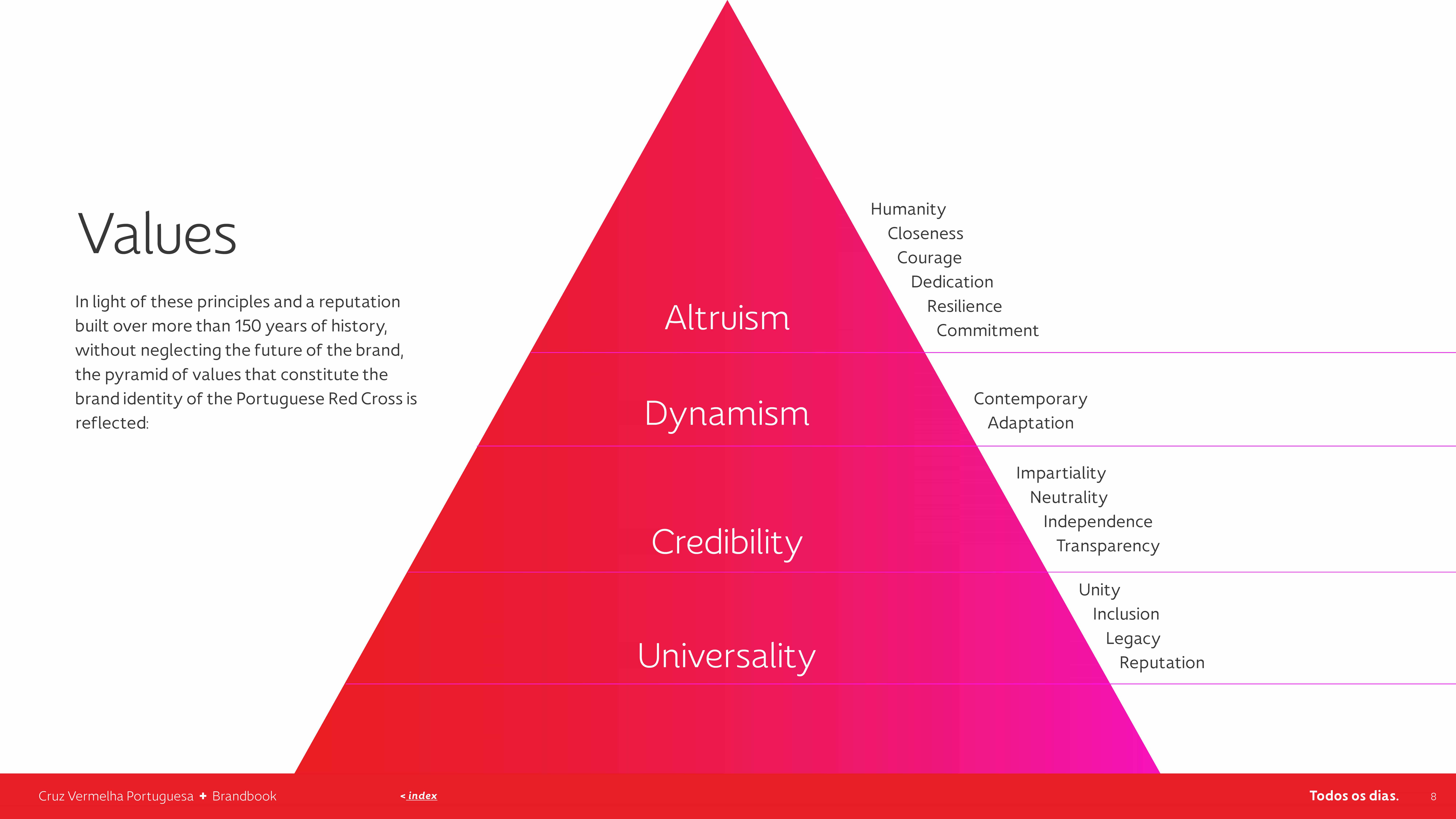
design for social impact: our approach
Brand Strategy: collaborative design for social impact tools (general survey and individual interviews); brand identity (clearing and realigning of values, vision, mission, message); brand persona (clearing and realigning of character, behaviour, tone of voice).
Brand Consulting: brand architecture analysis (synergies identification to boost brand and sub-brands; SWOT analysis); service design (target audience identification and user journey analysis; brand touchpoints identification and optimisation); brand positioning analysis and communication strategy realignment (sampling of references, positioning criteria identification, repositioning goals and mapping, operational implementation guidelines).
Branding & Storytelling: core creative concept and brand narrative; anchor tagline ad variations; visual universe: logotype adjustment, branded customised typography, iconography, photography style guidelines, comprehensive brand book.
design for social impact: accessing the “why?” during the brand consulting stage
The rebranding project began with a brand perception questionnaire completed by over 1,000 individuals selected by the Portuguese Red Cross, primarily those with a current or past connection to the institution who represent(ed) the brand and know it thoroughly. The sample included volunteers, employees, and older and younger people from various intervention areas and different parts of the country. It allowed us to obtain a comprehensive set of data to infer the degree of misalignment between the brand’s core identity and people’s current perceptions.
If, on the one hand, we sensed the enormous affection, pride and satisfaction people feel in wearing the institution’s jersey, on the other hand, we were also able to identify some disappointment and frustration. Anyone who lives and breathes the institution’s principles and mission, carrying out its work on the ground, nurtures an expectation of recognition. They know, first-hand, the value, relevance and impact generated in the lives of others, and this is something that the brand should emphasise and communicate.
Following the questionnaire, we also interviewed a pool of stakeholders, people in important positions and with relevant responsibilities within the institution. In all interviews, we felt the same reverence and pride from people working under the institution’s values. However, we also confirmed the same disappointment about the brand’s increasingly faded voice. Everyone expected to see the brand communicate more comprehensively and vigorously in digital and non-digital channels and platforms, where competition for the public’s attention requires increasingly creative, fresh and meaningful advertising.
So, essentially, everyone revealed their wish to see a large-scale brand and communication repositioning, which we felt as a thumbs up and strong encouragement to go forward with a profound revision of the Portuguese Red Cross brand and design for social impact. Just what we were looking for!
Brand perceptions misalignment
Rebranding a legacy brand requires thorough research, context, and upstream consideration so that its development and implementation can follow purposeful and concrete objectives that ensure cohesion and consistency downstream. Considering this first layer of complexity, let us not forget to add the intricacies of design for social impact. We needed to understand where we were headed, why we were going there, who we were doing it for, and how we planned to achieve it.
Our premises were clear: the public knows the institution’s humanitarian message and its merits. This iconic brand personality was built over 160 years, with several generations contributing to its development. Everyone knows that they can count on the Red Cross and that it depends on each person’s contribution. But if everyone knows and recognises the institution, why is there a feeling of detachment? Why do public empathy and emotion seem to be turned off?
In all long relationships, the key to success usually lies in good communication. Could the Portuguese Red Cross be part of an old, worn-out relationship?
repositioning goals: design for social impact to realign brand perceptions
Time brings inevitable progress, unfolding at its own pace. The Portuguese Red Cross found itself at a critical crossroads: adapt to a new era or risk fading into irrelevance. On the one hand, there was a clear notion that if the brand’s communication remained in the same mould and kept using the same tools, it would, inevitably, head towards stagnation and a consequent distancing and decline in people’s involvement with its mission.
Alternatively, the need to invest in updating the brand and its communication strategy became clear. Bringing it into modernity and reaching the spaces where its target audiences currently live and engage was essential. These are the people who need to connect with the Red Cross message and support its humanitarian mission as volunteers and donors. To effectively reach them, the brand must resonate with their needs, recognise their values, and stay connected through new channels, platforms, and formats. Thus, the underlying issue was identified, and the challenge was set.
We realised that the Portuguese Red Cross needed to keep up with the demands of today’s communication space, where resources are increasingly diverse and the competition for the public’s attention is highly competitive. Survival in the third sector relies heavily on fundraising efficiency – being successful in this task requires not only a deep knowledge of the target audience profile but also a fine-tuned sensitivity to speak directly to people’s hearts, using fluid dynamics that cross barriers and meet audiences organically. Design for social impact must consider these aspects, too.
The key words? Proximity, dynamism, visibility!


Dusting off the brand pillars and reviving the brand persona
We needed to dust off and revive the Portuguese Red Cross brand persona, dress it up in new clothes and give it a contemporary and relatable tone of voice.
We began by revisiting the brand’s pillars—values, vision and mission—in order to refresh, adapt and simplify them to integrate a brand strategy that focuses on getting the message across to the recipient. Starting from the institution’s founding principles to identify the brand’s values, we proceeded to dismantle the mission into four vectors that allow each of the Portuguese Red Cross’s areas of intervention to be broken down and explored through different formats, adapting to diverse platforms and conveying its message more efficiently.
We also realised the need to anchor the brand strategy in a tagline that could condense its character in an abbreviated and memorable hook to push cohesion and consistency to brand awareness efforts. It needed to be short, simple and flexible so that, like the institution itself, it could be adapted to respond to any context. Our minds began to wander through a sea of ideas!
design for social impact: diving into the brand experience journey
This was not our first time designing for social impact, but it surely was the most demanding. Design for social impact is, at its core, human-centred. Its purpose is to enhance the human experience in a specific context which requires collaborative work and an encompassing understanding of the challenges ahead.
In the context of charities or NGOs, we must grasp the nuances so that we can improve the desired aspects of the experience. In the particular case of the Portuguese Red Cross, we had to get familiar with the different types of users, their specific wants, needs and the touchpoints along the brand experience. Only after understanding each of these items, were we able to address the overall experience, both in terms of brand perception and in terms of communication strategy, and design to enhance the moments where the brand was not succeeding.
Having realised what was causing the gap between the Portuguese Red Cross and the public’s perception of the brand, and after reviewing its message and mission, we looked at the brand’s experience journey from the point of view of its different “customers” to pinpoint communication issues and fine-tune the rebranding efforts towards a design for social impact result.
In the process, we identified key touchpoints throughout the brand experience and, at each stage, demonstrated how to proactively and intentionally engage with the public using modern, dynamic, relatable, and, above all, empathetic formats, content types, images, tone of voice, and messages.
We concluded that the Portuguese Red Cross needs to communicate more and better in the context of everyday life, not just episodically and in emergency contexts. The public takes for granted that the Red Cross will always come to the rescue in exceptional moments of crisis. However, the truth is that, every single day, the Red Cross carries out exceptionally relevant social work that impacts many people’s lives, a global effort that is essentially invisible to the general public.
By working on the brand’s stage-by-stage customer journey, we wrote the story of each potential user, beneficiary and donor; then, we characterised the channels and platforms where the brand’s audience moves, suggested adaptations to the content and message at each moment; plus, we developed a series of suggestions focused on tactical objectives to achieve the desired design for social impact and strategic repositioning, that can give the Portuguese Red Cross brand more visibility, more presence and a wider sense of proximity. The final goal was to put the humanitarian message on people’s minds and encourage them to get involved, either by volunteering or donating.
devising the visual repositioning
After outlining and thoroughly analysing the customer journey, we developed the relative positioning map. Our relative positioning analysis allows us to understand where the brand stands regarding its image and communication style within a universe of reference brands.
We already had the framework but needed to substantiate the tools that would enable the Portuguese Red Cross’s repositioning in terms of its image and communication style. Having a clearly defined brand positioning is vital to communication efficiency.
To define the sample of brands included in the analysis, we considered our previous insights and remarks on brand identity and strategy and the questionnaire results while focusing on two fundamental aspects: the brand persona and the brand’s message.
The sample included mass market brands communicating to the general audience and not necessarily from the third sector or with a design for social impact focus. We then defined eight evaluation variables concerning brand image and communication style that would allow us to individually analyse and classify the current positioning of each brand, including the Portuguese Red Cross.
Whenever we carry out this type of positioning analysis, we immediately tend to observe that different identity spectres take form. The selected brands start forming “clusters”, and a more comprehensive positioning map takes shape, enabling us to ascertain the desired positioning for the Portuguese Red Cross.
As we translated the individual brands’ analysis and their several aspects into a two-vector comprehensive positioning map that condensed those aspects, we obtained a macro perspective that confirmed the evolution path the Portuguese Red Cross would have to undergo to reposition its identity and communication.
The former visual universe of the Portuguese Red Cross was reviewed, entailing all the visual elements of the brand identity – logo, colours, typography, iconography, photography and existent content. This exercise unfolded over several weeks due to the density, dimension and complexity inherent to the brand’s universe.
time to uncover the core creative concept
At KOBU, every rebranding process goes through a brand consulting stage that starts with comprehensive research and analysis to set the goals, feed the strategic insights and ground the creative proposal. The Portuguese Red Cross rebranding process had a dense brand consulting stage. Its repositioning goal was understood from the beginning, but the clear definition of the desired positioning took much consideration before we could determine which clothes would best fit this renewed brand persona. How should it behave? What would its voice sound like?
Ideas immediately started popping up!
The core creative concept focused on bridging the gap between the brand strategy conclusions and the emerging new brand identity. As a general guideline, a core creative concept should suggest action, drive the brand’s behaviour, convey its essence, and define how it should manifest and in what form. The Portuguese Red Cross saw its core creative concept sprout from the institution’s dimension and its undeniable legacy – essential ingredients to the brand’s longevity.
And so the core creative concept bloomed!
above and beyond the institution: more than a cross
By looking at the brand as a concept above and beyond the institution, reading more than the literal interpretation of its symbol, we wanted to rescue and praise its legacy and recognise its invaluable uniqueness.
Within layers and layers of meaning, we saw the enormous humanitarian contribution from the Portuguese Red Cross for more than 160 years of close and constant presence in Portuguese society. Through the most challenging moments of its history, a hopeful attitude towards the future brought hope and dignity to so many. The brand is precisely the result of this construction, from its foundation until today and tomorrow.
The Portuguese Red Cross is more than a cross; it is a force and a movement that we could translate into the key vectors that imbue the brand – identifying these vectors enabled us to devise the path to achieve the brand repositioning goals:
– Presence, translated into proximity;
– Organicity, translated into humanism and empathy;
– Energy, translated into dynamism;
– Hope, translated into comfort, humour, creativity and colour;
Now, we had the core creative concept of “More than a cross”. How could we personify the feeling behind this strong statement? What is the hidden meaning behind the famous cross that symbolises this 160-year-old brand? What is the cross beyond the heritage of so many generations of volunteers and the goodness they brought to the world?
There is a memory of a humanitarian legacy and social work that is deeply intertwined at the seams of our society. Despite acknowledging this reality, people have become so accustomed to the Red Cross’s presence that they take it for granted, and they go about their daily lives and barely remember it.
We needed to bring the Red Cross to the front of people’s minds and relight their notion of its importance and impact while reminding people that they are part of the Red Cross’s mission. We uncovered the human qualities behind the brand’s symbol to rescue it from the cold and institutional mood that crystallised the brand in time.
In practical terms, we explored this image quite literally as we experimented with physical materials in our search for key visuals to test and understand the visual impact of this conceptual interpretation. Because as the Oracle would say to Neo: “We can never see past the choices we don’t understand!”
Design for social impact: exploring a 160-year-old storytelling
Cue the brainstorming sessions where we’re cutting and pasting like kindergarten pros because why should kids have all the fun?!
And what does that look like in practice? Imagine a canvas with a colourful cast of characters – seniors holding a caring hand, families overcoming obstacles, volunteers rocking their superhero capes. Piece by piece, we’re weaving together a tapestry of compassion and connection with the iconic Cross at its heart. Imagine a giant cross formed not by wood or stone but by the countless stories of people whose lives intersect with the Portuguese Red Cross.
Take old Miss Justiniana, for instance. She eagerly awaits the comforting presence of Red Cross volunteers, who bring more than just food and healthcare – they bring solace to her lonely days, becoming the family she never had. Or Mr. António, whose knees need a little extra TLC to keep him climbing stairs. Or a family of four, to whom the Red Cross isn’t just a safety net but the key to accessing education and opportunity.
On the other side of these stories of people in need, there’s Maria, who rushes to the aid of the Red Cross whenever an emergency call comes in. And José, who drives the ambulance where Manuel lends a helping hand. And so many other anonymous people who carry through the Red Cross’s mission and play a vital role in keeping its spirit alive and kicking. From dedicated volunteers to the generous public, the collective efforts of individuals like these ensure the Portuguese Red Cross continues to thrive, serving those in need with compassion and care.
These individuals are more than just beneficiaries and volunteers; they are the heart and soul of the Portuguese Red Cross, and their stories intertwine with the organisation’s fabric, enriching its purpose and impact. Together, they embody the true essence of the Red Cross—a community of diverse individuals united by altruism, resilience, and the shared goal of making a positive difference in the world.
All of this is definitely “More than a cross”. It’s a vibrant tapestry of humanity, where every thread contributes to the larger story of hope and solidarity.
Enter the tagline: short, sweet and oh-so meaningful!
Since the strategic phase of this rebranding project, we understood that having a tagline would be an efficient communication tool to mould brand perceptions and achieve a successful design for social impact. Even though we had already spotted this need it was only when we unlocked the core creative concept and the brand storytelling that the new signature started to take real shape.
We wanted to balance the Portuguese Red Cross’s institutional weight with a more down-to-earth communication approach, aiming to make the brand’s mission clearer and closer to the public with a very straightforward message. Overall, this tagline should be able to last over time and affirm the brand’s identity, reach and relevance throughout its communication strategy. It had to be an honest, short, simple and direct affirmation that could assertively translate the brand’s charisma and purpose.
At first, our choice felt too simple, even to ourselves. But as we looked at it again and again, those three words revealed their power:
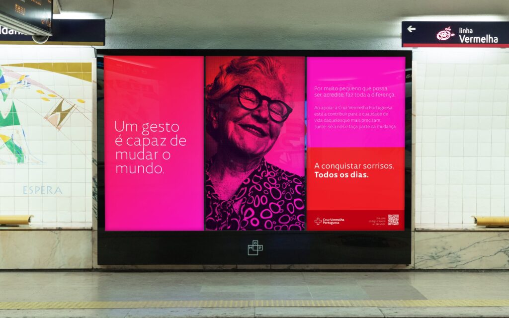
Every single day (Todos os dias)
The Portuguese Red Cross plays a vital role in many sectors. Every single day. The institution responds to emergencies and provides social assistance, education, and medical assistance. Every single day. The scale of its reach ensures help to countless people who rely on the institution’s support for food, shelter, health, education, and so many other things. Every single day.
It was a perfect fit to translate the institution’s omnipresence while fostering the rebranding repositioning goal by reminding people of its presence, visibility, and proximity. This was the type of affirmation that effectively fit our design for social impact purpose in this project – it is a democratic statement as it speaks to everyone, yet it is impactful and meaningful because everyone can recognise the truth behind it, the fact that the Red Cross is present in every darkest hour. Still, we felt we needed an additional layer of truth.
Despite having found a charismatic and encompassing affirmation to serve as a brand signature, we also needed to convey the level of coverage and diversity of services provided by the Portuguese Red Cross. We decided to add a variable component to this tagline to communicate the institution’s multiple fields of action.
With this tagline architecture featuring both a fixed and variable component, we unlocked endless possibilities. This customisable approach enabled the brand to adapt its communication to any context, while its architecture became a powerful tool, offering the brand a sensitive, adaptable, and timeless signature.
tone of voice: a simple and flexible architecture
During the strategic stage of the rebranding process, and within our efforts to design for social impact, we realised that the brand needed to refine its tone of voice to get closer to the public. It required more straightforward, more direct, and less formal communication that could, on the one hand, inform about the specific aspects of the Portuguese Red Cross’s mission and, on the other hand, rebuild the emotional connection with the audience, rekindling the flame that had faded over time.
In other words, it was necessary to provide the brand with a flexible tone of voice that, like the tagline, would enable the brand to communicate not only its different operation areas but also consciously and proactively work to foster brand awareness.
These needs were translated into a tone of voice architecture that unfolds in two tonalities, balancing operational and conceptual communication.
On the one hand, a more creative, metaphorical, and personal tonality allows the brand to explore brand awareness content by inviting curiosity, humour, and emotion. And, on the other hand, a more functional, concrete, and objective tonality to feed daily communication and inform about the institution’s mission and services.
Umana™ typeface Family: a powerful design for social impact tool
One factor that limited visual communication in the Portuguese Red Cross brand was the use of Helvetica, a typographic font that conveyed some coldness, rigidity and a feeling of anonymity, giving the brand a distant and unempathetic visual style.
In this repositioning effort for the Portuguese Red Cross, we aimed to provide the brand with a typographic family that supports its design for social impact while capturing its essence. Embracing the challenge of creating a customised typographic family, we sought to visually translate its tone of voice, inspired by the dedication, courage, commitment, and resilience central to the brand’s mission and message.
We aimed to embed these qualities into the typography, particularly through its style. The goal was to create a typography that brings the Portuguese Red Cross closer and more present—in sum, more human.
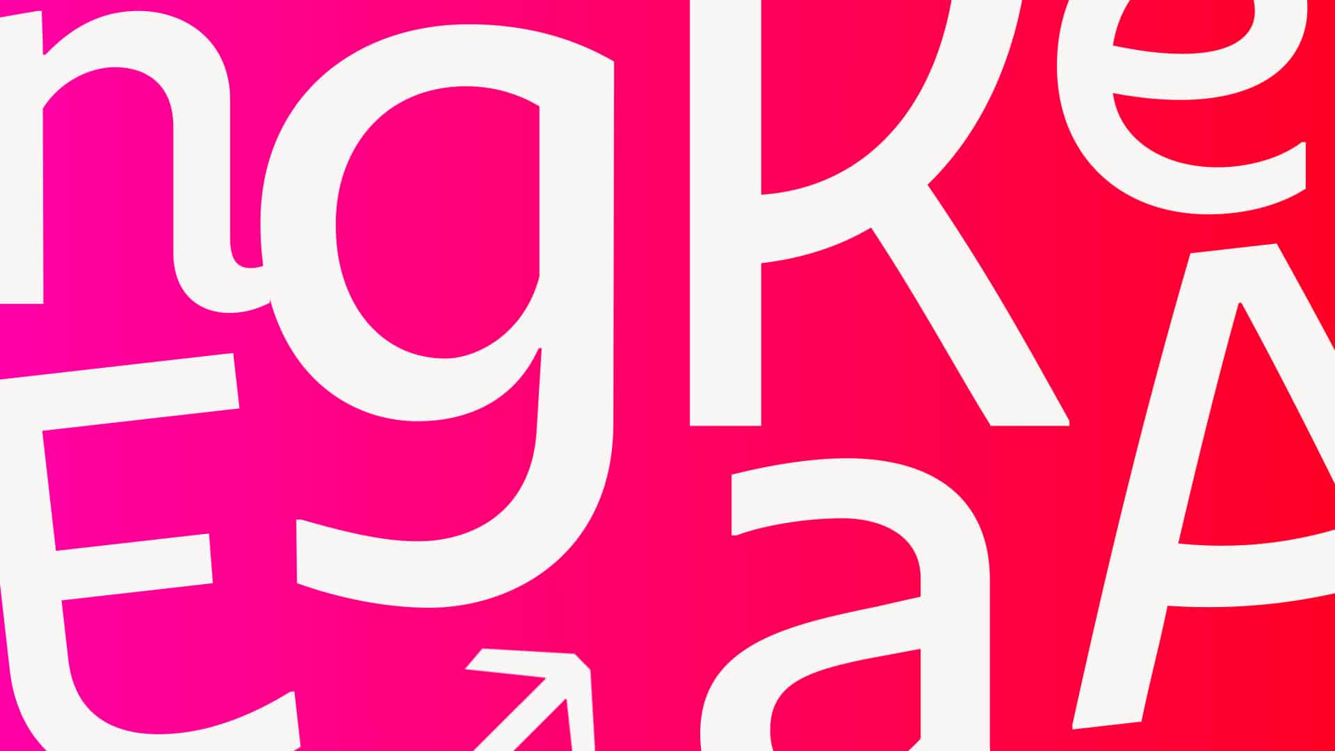
The Latin adjective “humanus” inspired the name for the Umana™ Family, a sans serif typographic family with a humanistic character composed of three styles: Umana™ Headline, Umana™ Text and Umana™ Text Italic. This typeface expresses contemporaneity through organic and fluid shapes that favour legibility and make it feel approachable and welcoming, characteristics that evoke a warm human touch.
Umana™ Text and Umana™ Text Italic were developed, as the name implies, for text, and they feature simple shapes that offer excellent legibility. The character set has uppercase and lowercase numerals, ligatures, arrows, and symbols (including symbols identifying the Red Cross). They support more than seventy Latin-derived languages and are available in four weights: light, regular, medium and bold, offering great flexibility. The difference between Umana™ Text and Umana™ Headline is in the typographic design of some characters, such as uppercase characters “A”, “C” or “E”, lowercase characters like “c”, “e” or “h”, and special ligatures like “c+e”, “c+o” or “f+r”. Umana™ Headline has three weights: light, regular and medium.
The development process of the typographic family was not linear. Some characters needed to be readjusted midway through because we wanted this to be a collaborative work effort with the Portuguese Red Cross team as they are the ones living the essence of the brand. The main challenge was to break the Helvetica coldness barrier and infuse the brand values into this new humanist typeface, granting the Portuguese Red Cross brand an identity tool that could serve the project’s design for social impact purposes and serve the brand’s communication strategy with a warmer, closer and more approachable character.
The art direction process: off to the creative playground!
For the sake of this case study’s structure, we separate the description of the art direction process, but the truth is that it started bubbling right from the core creative concept stage! After all, a rebranding project with design for social impact as a core purpose is a construction that must involve all stages. Remember the motto “More than a cross” and the storytelling behind it? It said that the Portuguese Red Cross is the sum of every individual story contributing to the purpose and impact of the institution and embodying the true essence of the Red Cross—a community of diverse individuals united by altruism, resilience, and the shared goal of making a positive difference in the world.
Before you start thinking this is just a conceptual construction with impossible visual translation to the real world, be advised: there’s a method to our madness! We always balance creativity with strategy, mixing bold ideas with a dash of technical know-how. At this stage, the million-dollar question was: how would we materialise the concept of individual human contribution into forming the Red Cross? What kind of design for social impact solution that’s not just visually stunning but also actually effective could we come up with? Talking about an exciting challenge!
We went on a wild goose chase trying to figure it out, and many options were thrown onto the table. Some had potential, and some were just bananas! We ended up with a quite literal solution: if the cross is made of people… let’s put people inside the cross! As we layered a collage of cutout images showing volunteers and beneficiaries, we built the Portuguese Red Cross from individual stories in a visual, physical piece, proving that the sum is greater than the parts. The client loved it as much as we did because it really felt aligned with the brand’s truth.
Using all the colours to go beyond what meets the eye
This rebranding required some brave decisions: the repositioning objectives were aimed at a type of audience accustomed to mass media communication, where there’s a high level of visual stimuli. The Portuguese Red Cross brand needed to keep pace with this visual evolution in order to succeed in its design for social impact purposes and shift brand perceptions to position itself as an updated, close and human brand that is tuned in and understands on-going trends. We had already gone one step further in the visual boldness level, but we wanted to go even further!
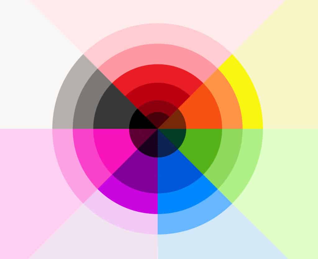
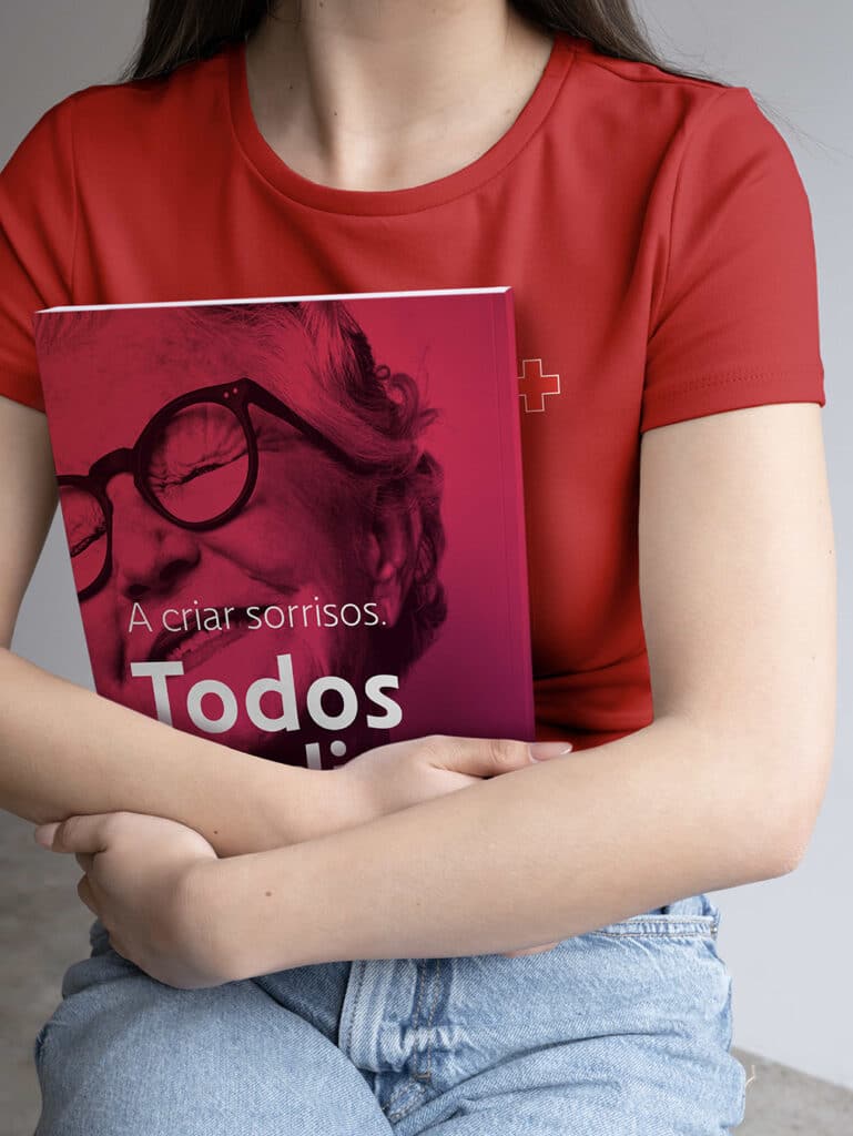
Welcome to the kaleidoscopic realm of the Portuguese Red Cross rebranding escapade, where colours aren’t just colours – they’re storytellers and mood-setters! Our decision to give the brand colour palette a facelift was a calculated move fueled by a burning desire to inject life and dynamics into the brand. Not that we don’t love and respect the brand’s legacy colour triad of black, white and regal red, but in light of this new positioning, having just those three colours (and a couple of variations of grey) felt somewhat limited.
Inspired by the institution’s fundamental principle of universality, we decided to embrace the entire colour spectrum. Pink, green, orange, blue, purple—we invited them all to the party as yet another conceptual statement we assumed during this process: we were celebrating the Portuguese Red Cross and honouring its omnipresence and multiplicity by breathing new life and boundless energy into this inimitable brand.
To add some extra pizzazz, we brought gradients to the dance by carefully mixing and matching selected colours that play nicely with each other and the almighty red. The result was a palette as dynamic and diverse as the humans who interact with the brand-talking about the real deal in design for social impact!

Putting the creative tools at the service of design for social impact: defining brand guidelines
It was time to put our left and right brains to work together! Creativity and organisation had to find common ground and entail a balanced dialogue. On the one hand, we had the boldness of having all the rainbow colours in the brand identity; on the other hand, we needed to give the brand operational tools for daily communication and logistics.
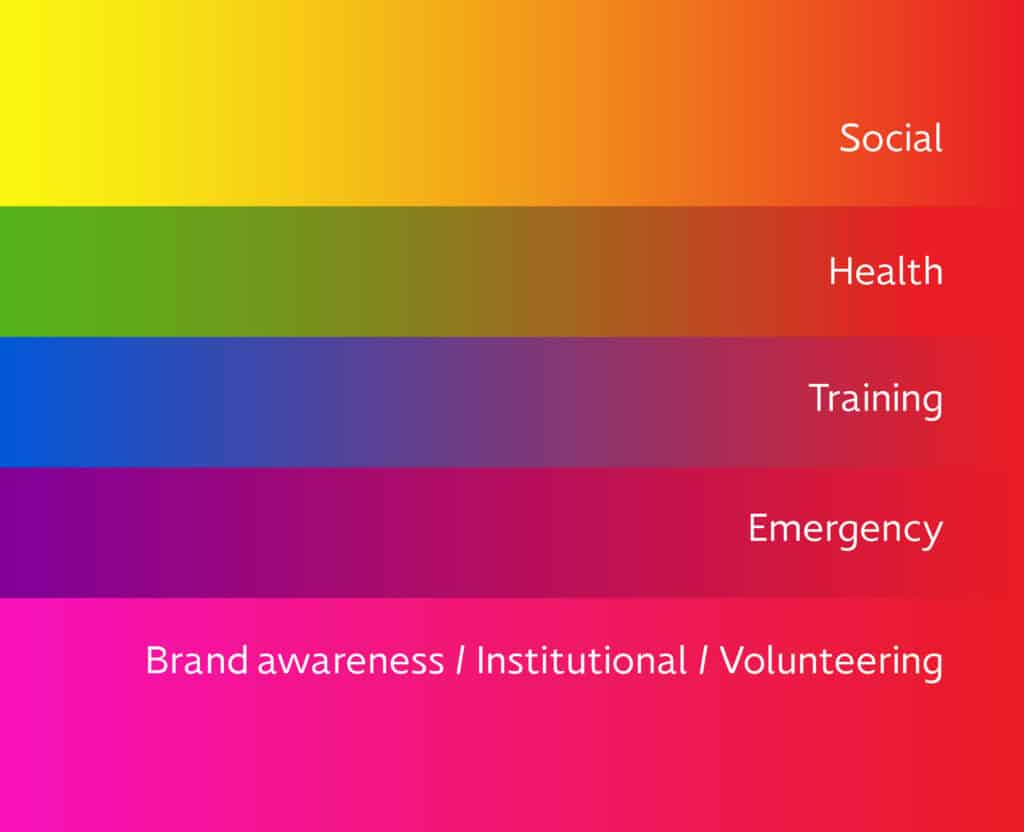
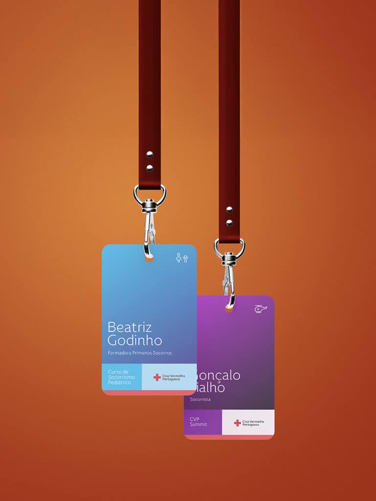
Assigning colours to the institution’s areas of intervention was an essential structural decision as the brand could then develop the brand touchpoint sets and have them visually organised under defined guidelines – this step was, in fact, the operationalisation of the design for the social impact toolkit. It was like playing matchmaker between colours and causes, trying to find the perfect pairings that would ignite emotions and spark action.
Reds and roses for brand awareness, oranges and yellows for the social area, greens for health services, purples for emergencies, and blues for education. It felt like assigning personalities to each colour within the brand universe where they all have their own job to do and their own story to tell. Think of it as a colourful puzzle, where every piece matters and every hue adds depth to the bigger picture.
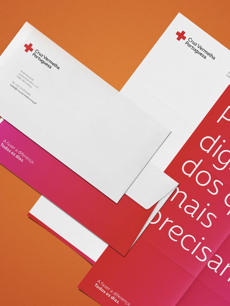
New layouts and specific templates were developed for social media applications and each area of intervention. These layouts followed a geometric logic to balance image, copy, and white space in a visual arrangement that was also applied to other brand assets and graphic materials, such as stationery and OOH.
The goal was to imbue the brand assets with life and rekindle the human touch as these new dynamics opened the way to the design of conceptual visual compositions serving as vehicles for the brand message in a captivating and utterly fresh approach to the Portuguese Red Cross communication.
Here’s to the future of the Portuguese Red Cross!
To conclude this vibrant journey, let’s raise a virtual toast to the transformation of the Portuguese Red Cross brand. With a flexible and structured tone of voice, a customised human-centred typography, a colour palette reflecting the diversity of the communities it serves, and an empathetic photographic style, the set of actionable design tools for social impact was prepared to effectively convey this new brand message.
This rebranding breathes new life into an institution rooted in tradition by embracing the whole spectrum of colours and infusing each hue with purpose and meaning, offering a vibrant and dynamic visual identity that reflects the humanity and altruism at the heart of the Portuguese Red Cross mission.
Here’s to a future where every shade tells a story, and compassion knows no boundaries. Here’s to the future of the Portuguese Red Cross brand, where every hue narrates a tale, and the spirit of empathy knows no limits.
Project Team
Executive Direction: Nuno Tenazinha
Creative Direction: Marta Gouveia, Sandra Lopes
Art Direction: Mónica Loureiro
Brand Strategy: Isabel Evaristo, Nuno Tenazinha
Copywriting: André Oliveira, Isabel Evaristo, Marta Gouveia
Project Management: Marta Gouveia, Sandra Lopes
Graphic Design: Vanda Pereira, Sónia Duarte
Logo Design: Brígida Guerreiro, Mónica Loureiro
Iconography Design: Beatriz Varela
Type Design: Brígida Guerreiro
Digital Product Management: Karolina Guilherme, Paulo Sá
UI/UX Design: Daniel Gomes
Motion Design: Pedro Santos
Web Development: Cátia Dionísio
Website Digital Strategy: SOLOS Agency (Cristina Pereira, Sara Jesus)