


Troia was a surprisingly comprehensive branding project! It kicked off with naming, but turned out to involve the development of three distinct brand identities. Quite a ride!
We were initially contacted to present naming proposals for three hotels on the Troia peninsula, because the operation was acquired by Details – Hospitality, Sports & Leisure from the previous operator. The hotels, formerly known as The Editorial by The Sea, Troia Comporta Hotel, Aqualuz Troia Mar & Rio, and Troia Residences, needed new identities aligned with the new owner’s objectives. As always, we first sought to understand the business context and the structure within which we would communicate. In doing so, we discovered business objectives related to brand positioning and the creation of spaces, which proved decisive in shaping the development of our work.
This project ultimately went far beyond the original naming request. It evolved into a complete brand consultancy and strategy engagement, resulting in the creation of three distinct, fully developed brand identities: one for each of the hotels. These identities became key assets in repositioning the Troia hotel units, strengthening their individual market presence. Additionally, they served to enhance the overall visibility and recognition of the Troia peninsula, directly supporting broader placemaking and brand positioning objectives as requested by the client.
Our Approach to branding in hospitality:
- Brand Consultancy: brand assessment questionnaires and stakeholders interviews; competition and references analysis; visual positioning; brand concepts activation and spatial implementation plan.
- Brand Strategy: brand namings; brand visions, missions, values, promises and tone of voices.
- Brand Design: creative concepts; visual universes: logos design, key visual patterns, collaterals, templates, brand books
hospitality: we know you and we love you
At KOBU Agency, we have a long track record in the hospitality sector. It is one of our core areas of expertise, and we are deeply familiar with the challenges these brands present, both in the mass-market and in the premium segment. We also have a strong portfolio in services closely connected to hotel operations, including food and beverage outlets, spas, and kids’ clubs.
It was from this accumulated experience that the approach for this project emerged. The initial request was limited to the urgent development of naming proposals for three hotels whose operations had been recently acquired by the group. The previous brands needed to be withdrawn from the operation, and the new management required a new face as quickly as possible.
So, a project with a deadline for yesterday? Of course! It was neither the first nor will it be the last.
However, it is one of our principles not to move forward without first asking at least a few unavoidable questions to ensure that the work is well-grounded and properly directed. What brand positioning should we aim for? Who will the hotels’ guests be? Do we want to maintain or expand the target audiences? Do we want to preserve or elevate the concepts? By diving into these questions, the client recognised how important it would be to have an initial phase of brand strategy and consultancy. The complexity and scale of Troia’s project demanded a branding investment that would provide the company with comprehensive brand identities ready to be used as communication tools for marketing and sales as well.

Kicking off with brand strategy
Following a questionnaire, interviews with stakeholders, and a detailed reflection on the information gathered, we identified two business goals that would prove decisive in the development of the branding. On the one hand, Details was committed to helping revive the Troia peninsula and renew its reputation. The place’s image in the public mind was still strongly associated with unplanned construction, difficult access, and a lack of quality infrastructure. On the other hand, Details’ objective was to increase the average daily rates of each of the three hotels; an investment in rebranding and refurbishing the spaces would bring them closer to the benchmark set by their neighbouring VIP destination, Comporta.
Armed with this understanding of the business objectives, we approached the branding project in a far more focused and confident way. From a communication perspective, we knew we were dealing with three distinct hospitality brands. One was a high-end, sophisticated, golf-focused hotel brand. Another was a friendly and open brand geared towards families and children. And, lastly, a low-profile, self-contained accommodation brand aimed at mid-to-upper segment self-catering guests. What they all shared, fundamentally, was the Troia peninsula itself. Its personality and charisma as an idyllic retreat defined by ocean landscapes, a strong connection to nature, and a rich historical legacy, fuelled the start of the branding process: the definition of each naming.


brand naming: an art and a process
At KOBU Agency, creating a naming is a brand strategy task that can follow two possible approaches, depending on the context.
On the one hand, it can be a highly emotional and intuitive process, i.e., the naming emerges from an almost direct and intimate association between the brand’s purpose and its meaning. In these situations, the name appears almost spontaneously, as if it were obvious and preordained.
On the other hand, it can be a highly rational process, and this happens when the naming results from research into brand territories and the intrinsic characteristics of the brand and/or the business, whether these relate to physical space, geography, history, or other associated elements and concepts. In such cases, arriving at a name that truly represents the brand is more reasoned and less immediate, as it is the outcome of successive choices and iterations.
In either case, the commercial aspect is crucial. Knowing whether a name is already registered or whether the digital domain is available is essential for the exercise to be effective. Defining a name that is aligned with the brand’s meaning, that is unique and memorable, but also preferably short, pleasant to the ear, visually workable, and commercially available… It’s quite a task! But thinking outside the box always helps. Often, swapping letters, cutting syllables, or inventing sounds leads to unexpected results. The trick is to test, test, and test again. And then wait a little. Because, like almost everything new, it takes time to win us over.
place-making: connecting the naming to Troia
In this project’s case, the task of defining the brand namings was influenced by the hotels’ connection to the location and by the hospitality concept each one was intended to offer. What kinds of elements represent Troia? What types of references resonate with the target audiences?
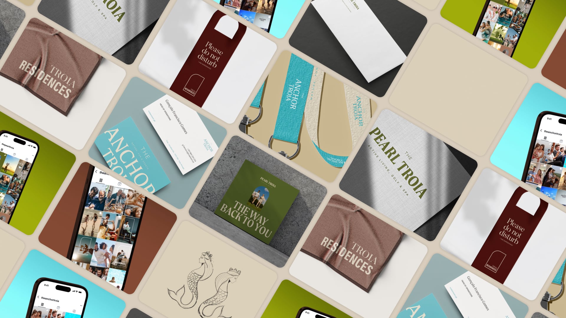
Troia Residences was the naming we recommended retaining, as it was fully aligned with the offering and already benefited from recognition among the target audience.
As for the other two hotels, we proposed The Pearl Troia and The Anchor Troia. Objectively, those are deliberately visual namings that reference nautical elements and connect with Troia’s natural Atlantic surroundings. However, metaphorically, they represent clearly distinct concepts, speaking to different audiences.
The Pearl evokes a sense of a premium, sophisticated, and exclusive retreat, making it the appropriate naming for a high-end hotel with an adults-friendly concept, aimed at a cosmopolitan audience.
The Anchor, by contrast, conveys the idea of a safe, stable, and reliable harbour and is a naming well-suited to a hotel entirely focused on families and children, with convenience at its core.
In response to the client’s desire to ensure highly effective communication, we developed signatures to accompany each naming and describe their concepts clearly and objectively.
aligning naming with visual identities
Although the client opted for independent namings for the hotels, as a way of safeguarding the flexibility of their portfolio, it was important to create a visual language that would run across all three brand identities. Taking into account the broader placemaking objective underlying the project, we knew the client wanted their three hotels to become not only top-of-mind hospitality units on the Troia peninsula, but also reference venues for hosting and activating events, particularly The Anchor. To achieve this, it was essential to develop distinctive and memorable visuals, clearly and unequivocally signalling the three brands.
Throughout the project, we built from a solid foundation of research and strategic alignment, evolving into moodboards and art directions that defined a clear, cohesive visual territory. After the initial approval, we moved into logo development and the core system foundations.
Midway through, as all good adventures tend to present, the client introduced unplanned changes that required a full structural rethink of the project. In other words, we revisited assumptions, priorities, and decisions we had already made. Ok, we can all have tantrums, but as motivational posters say: if you fall, cry all you want, then you have to get up, rather sooner than later (maybe not ipsis verbis…)
Alas, this context underlined and taught us, yet again, how essential it is to adapt to mid-project briefing changes while protecting focus, consistency, and momentum.
Rather than extending the cycle with unproductive back-and-forth, we took a pragmatic approach: we reshaped priorities, simplified decision points, and accelerated production to meet immediate needs, keeping as much coherence as possible within the new constraints.
The logos and visual universe were developed at roller coaster speed (yes, the analogy is very on point), focusing on clear, functional, implementation-ready solutions with strong legibility, versatility, and adaptability across key touchpoints.
All logotypes and brand universes are distinct, yet they share key elements that make them feel connected. The “Troia” wordmark is ever-present, and the logo construction and grid system remain consistent across brands, preserving visual cues of belonging.
The colour system was also designed to sit within a shared universe, with each brand leaning more heavily into a particular hue. Across photography, colour use, layouts, and patterns, every choice reinforces the core feel of each brand.
The Pearl signals a more boutique experience. Green naturally anchors the golf world and everything that comes with it: refined, elevated, and more exclusive.
The Anchor lands in a more mass-market space, oriented to families and events. It’s the go-to hotel, with light blue carrying sea, ease, and a sense of fun.
Meanwhile, The Residences focuses on nurture and comfort, a cosy home-away-from-home, where deep browns take precedence and create warmth and stability.


Bringing the Creative Concepts to Life
As we were creating the concepts and designing the visual identities, we immediately started thinking about how those would play in the spaces of the hotels. Each hotel had its own concept, its own audience and its own messaging, so applying the concepts to initiatives and to the different hotel amenities themselves would have to play out differently, according to each one’s goals. The fact that we were serving three segments allowed us to imagine all kinds of interactions between the hotel and the guests and list a series of suggestions for interactions that could translate each hospitality unit’s positioning as well as meet the audience’s expectations.
This project included lists of ideas and suggestions to bring the creative concepts to life in practice. Having visited the hotels before, we were familiar with the circulation areas, common and private spaces, and were able to envision ways to bring life and added interest to each area in order to elevate the guest experience and create a welcoming and memorable atmosphere.
Ideas like having equipped specific areas to serve digital nomads, or remote workers, offering enough privacy and comfort or designing microspaces using indoor plants and furniture to create lounge areas that fully convey rest and vacation, or even suggesting olfactory marketing initiatives, like creating fragrances for the hotels to imprint people’s minds through their senses. Every suggestion aimed to welcome and inspire guests, using the space as a canvas where the brands could materialise and convey particular feelings, offering people a sensory memory of a pleasant staying experience.


Creating a naming for a brand is almost like naming a child. Views and opinions may differ, and the process is not always smooth and seamless. Sometimes it’s more cerebral, and at other times, it’s more emotional. But the end result should feel meaningful, be beautiful and memorable.
In this particular case, adding a strong tie to Troia to the brand identity of each hotel proved to be an organic option. It not only made sense but also helped revive such a paradisiacal haven.
PROJECT TEAM
Project Manager and Executive Creative Direction: Sandra Lopes
Brand Strategy and Consultancy: Nuno Tenazinha & Isabel Evaristo
Creative Direction: Marta Gouveia
Art Direction and Brand Design: Mónica Loureiro
Brand Design: Sónia Duarte
Graphic Design & Iconography: Beatriz Varela
Motion Design: Pedro Santos
Copywriting: Isabel Evaristo & Marta Gouveia